
Markets drop. It happens. When your investments take a hit, your reaction can range from mild concern to full-blown panic. There’s no universal way to manage a portfolio during a downturn, so you’ll need to factor in the nature of the market, the nature of the downturn, and the nature of your portfolio goals when deciding what to do. To help you in planning, we’ve invested some time researching past corrections to offer some insight around how they’ve played out in recent history.
A PDF version of this article is available here.
There are lots of different kinds of drops the market can progress through, including pullbacks, corrections, crashes, and bear markets. While there is no universally accepted definition for each of these, there is some general consensus on the ranges of drops they entail.
In this article, we’re going to specifically dive into some research on a very specific scenario: corrections in the S&P 500. We’ll specifically use data for its most popular tracking ETF, SPY, in order to have a reliable proxy for the larger US equity market.
What is a correction?
We’re going to use a 10% drop from the all-time high as our indication that the market has entered a correction. Once the correction has been entered, that correction cycle will be considered active until the market reaches a new all-time high. Once that happens, we can look back to analyze the complete correction cycle with the following milestones:
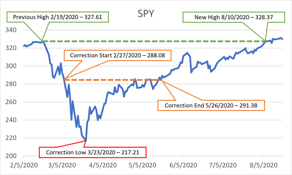
- The previous high is the most recent all-time high prior to the correction.
- The start is the first closing price at least 10% down from the previous high. While it could be argued that the correction really begins at the previous high, our analysis is primarily concerned with what happens once the correction has been confirmed.
- The low is the lowest price during the correction.
- The end is the final closing price crossing above the original correction start price. Note that price may cross above the correction starting price multiple times throughout the correction, but we’re only interested in the final time it does so as it’s the point where the market will not return to correction territory in this cycle. This is something we only know in hindsight, of course.
- The new high is the first all-time high reached after the correction has begun.
Here’s an example using the 2020 correction.
Note that the SPY quote data used for this article uses the CRSP methodology, so it’s been adjusted for dividends. As a result, the prices will be lower than the actual closing quotes for days prior to December 17, 2021. The divergence will grow larger as the dates go further back.
Our definition of a correction is partly intended to offer a concrete way of measuring performance. Some may argue that a correction that ultimately exceeds 20% to be a bear market, but we’re not going to split those hairs. We’re also not going to account for price level resets where a new correction could theoretically begin before the current correction has achieved a new all-time high.
Goals
Our goals here are to use data to help answer some of the frequently asked questions about past corrections, including:
- How often do corrections happen?
- How long does it take to enter a correction from a high?
- What can we expect once we enter a correction?
- How does the market perform during a correction?
- Is it worth trying to call a bottom?
- How long does it take to recover from the bottom?
- What happens after corrections?
- What can we do with the data we have?
- What happens if you invest at the start of a bull run?
- How do we know when a correction is coming?
- How do we know when a correction is easing?
- What kind of returns can we expect from different correction milestones?
- Is there an ideal strategy for correction investing?
While there are several important milestones over the course of a correction, it’s important to remember that there are only two we’ll know we’re at when they happen:
- The start of the correction, when we’re down 10% from the all-time high.
- The end of the correction cycle, when we hit a new all-time high.
All of the other events will only be identifiable well beyond the point where we can do anything about them.
How often do corrections happen?
Based on our simple definition of a correction, a pessimist might see the market in one of two ways: we’re either waiting for the current correction to end or waiting for the next one to start. Since the SPY ETF only began trading in 1993, we have slightly under thirty years of data to analyze to see where we are more often. Over that period we’ve had eleven corrections, which indicates an average of one every 2.7 years.
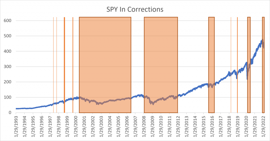
In the graph above, the shaded areas represent the period where the market was in correction. The left edges represent the first day it traded down 10% from the all-time high while the right edges are the final time it traded below 10%. Note that there is some significant variability in the corrections that fit our definition, but we’re not going to trim outliers. All analyses performed here will include all data weighted equally.
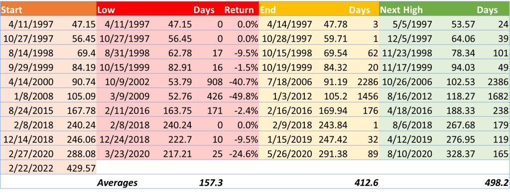
Here is a more detailed breakdown of the data for these corrections.
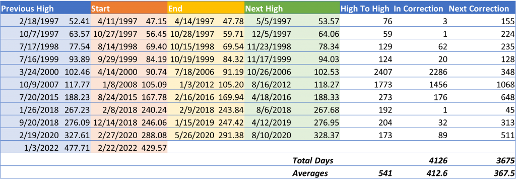
High To High answers “How long does it take the market to regain a new high after the previous pre-correction high?”
In Correction answers “After we enter correction territory, how long does it take for the market to clear correction territory for good?”
Next Correction answers “Once the market reaches its first post-correction all-time high, how long does it take for the market to reach the next pre-correction all-time high?”
Note that the market was not in a correction when the ETF began trading in 1993 and had not yet exited the 2022 correction when this article was written. As a result, the total number of days spent in correction territory is likely to be less than the time spent between the all-time highs that bookend correction cycles.
How long does it take to enter a correction from a high?
Bull markets, like all good things, must come to an end. While there may be many smaller pullbacks over the course of a bull market, we use the 10% decline threshold to identify the start of a correction.
Here’s the data on how long it takes to go from an all-time high to correction territory.
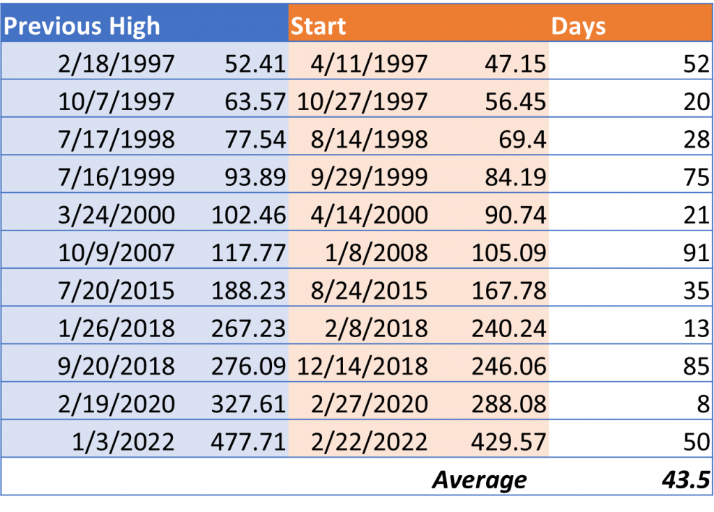
Days answers “How long does it take to enter correction territory from an all-time high?” However, this specifically measures the distance of a correction from its most recent all-time high. There can be many new highs between corrections, so it’s not possible to know if the latest all-time high will be the last one ahead of a new correction until the 10% drop.
Using the data from earlier, we know that the time from a post-correction all-time high to the next pre-correction all-time high has ranged from 45 to 1,068 days and averages slightly over one year at 367.5.
What can we expect once we enter a correction?
Imagine you’ve just heard the worst financial news in months: the market closed today and it’s down more than 10% from all-time highs. We’re now in correction territory. What should we do?
Should we expect a bounce? Should we go flat? Should we add a hedge? Should we liquidate the hedge?
Unfortunately, it’s unpredictable. Just like the circumstances that drive the market into a correction are tough to see coming, so are the near-term market responses that happen once we enter the correction. These responses, whether related to financial sentiment, government intervention, geopolitical volatility, or whatever, that impact the duration and severity of the correction.
Here’s a look at the timeline data from the perspective of the day the market has entered a correction.
Low Days answers “How long does it take a correction to bottom once it begins?”
Low Return answers “How much further does the market fall after the correction starts?” The peak decline of the correction cycle from all-time highs is about 10% higher.
End Days answers “How long does it take to exit a correction once it begins?”
Until Next High Days answers “How long does it take to get back to all-time highs after we’ve entered a correction?”
Based on the data, around a third of corrections bottomed for a day and the market immediately rebounded. Another third bottomed out within a few weeks. However, when the market didn’t bottom within four weeks, it took anywhere from six months to nearly three years to finally find reach an ultimate low.
How does the market perform during a correction?
Corrections mean a lot to investors. There’s something about reaching two digits of negative return that really grabs attention. However, the good news is that the market generally responds well once the correction hits. Most of the time it recovers to all-time highs within six months.
Here’s a breakdown of the returns for various terms once a correction has begun.
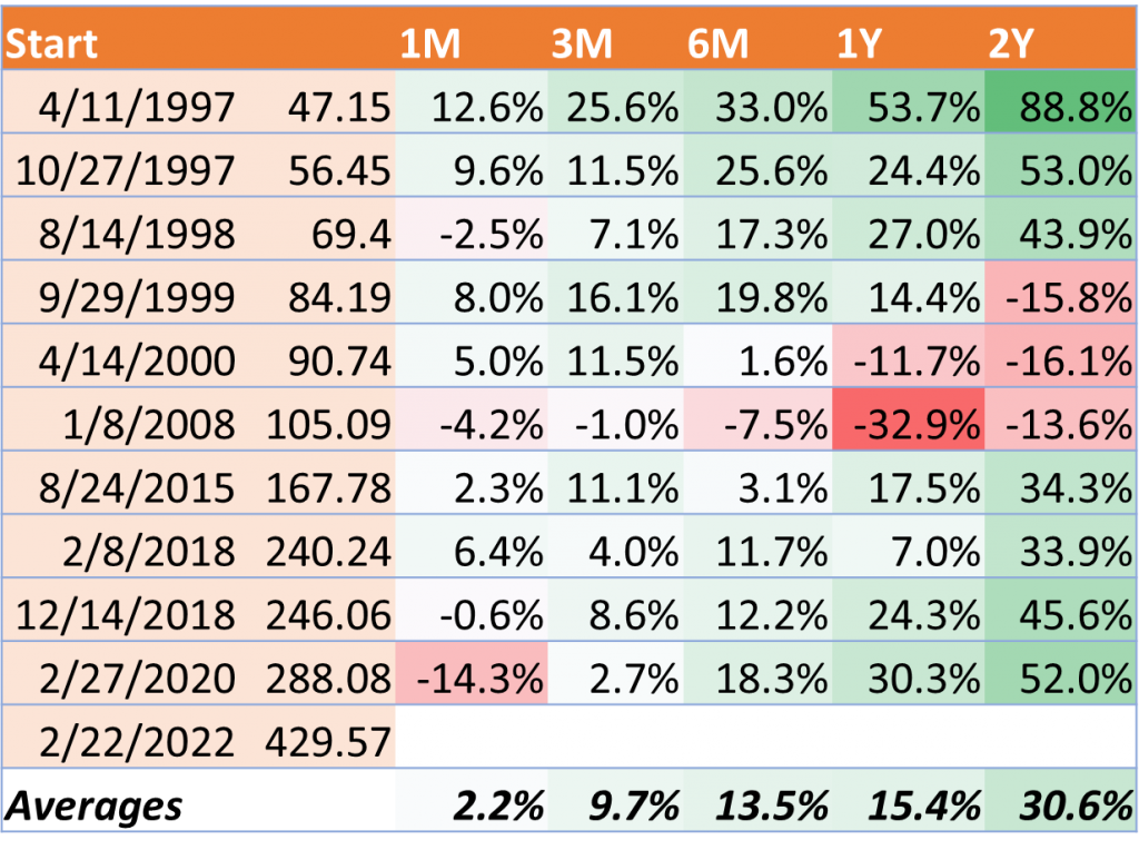
While the market has historically rebounded from corrections, the strength and speed of the recovery vary. It’s also important to note that there’s a speed bump around half the time where the market draws down between the terms selected here, and it’s almost always between the six-month to one-year terms when it happens.
Is it worth trying to call a bottom?
There is a ton of opportunity for massive returns if you invest at the bottom. Unfortunately, there’s no way of knowing you’re at the bottom until the correction is over. However, all past corrections eventually returned to all-time highs, so investing during a downturn—bottom or not—has historically yielded positive returns.
But if you can manage to call the bottom, the returns are almost always stellar.
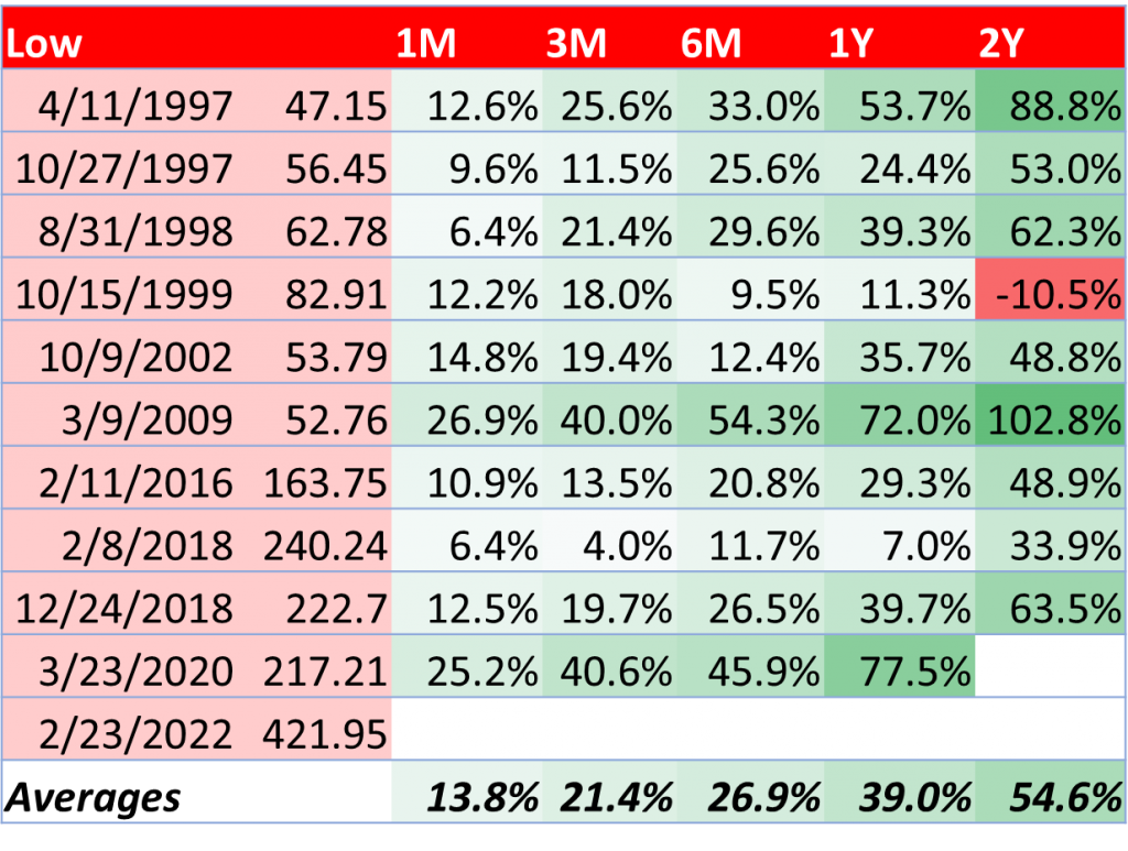
How long does it take to recover from the bottom?
By definition, any movement from the bottom will be positive. However, it requires a lot of upward movement to recover from some of the deepest bottoms, especially if it took months to get all the way down there. Here’s how many days it took for the bottom to exit the correction and reach a new all-time high.
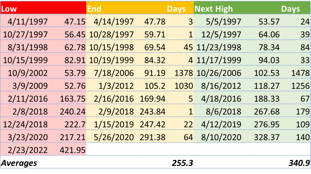
End Days answers “How long does it take to exit a correction once it bottoms?”
Next High Days answers “How long does it take to reach new all-time highs once the market has hit a low?”
While the market usually hits fresh all-time highs within six months of bottoming out, some of the corrections have been devastating and taken much longer. The bottom reached in March of 2009, for example, was over 6% below the bottom hit in October of 1997. It took eighteen months to drop from its all-time high to this eventual low, and then well over three years to get back to new all-time highs.
But it did happen. And it [hopefully] always will.
What happens after corrections?
The periods between correction cycles, which we’ll call bull runs, take up all the space between the first post-correction all-time high and the last pre-correction all-time high. Note that we’re making a distinction between bull runs and the larger bull market they’re in. If a bull market is the period between one correction’s low and the last all-time high ahead of the next correction, the bull runs we’re focused on here only start at the first post-correction all-time high. This is important because we can actually recognize that milestone when it happens, thus offering the ability to meaningfully act on it.
Here’s what those periods look like.
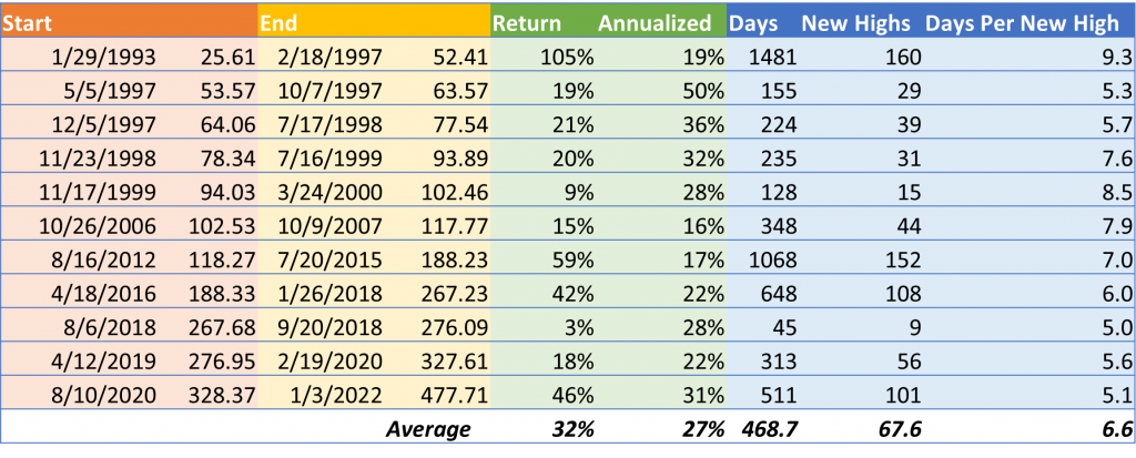
Return answers “What is the total return for the bull run?”
Annualized answers “What is the total return for the bull run on an annual basis?”
Days answers “How long was the bull run?”
New Highs answers “How many new all-time highs were reached during the bull run?”
Days Per New High answers “How many days are between new bull run all-time highs on average?”
There’s some great news here. When the market exits a correction cycle by reaching a new all-time high, it tends to continue to grow for an average of well over a year. Unlike corrections that often bounce immediately or within a few weeks, all bull runs in recent history lasted at least six weeks.
Unfortunately, the returns are based on the idea that you would perfectly time the sale at all-time highs, which isn’t feasible.
What can we do with the data we have?
While most correction cycle milestones are only identifiable in hindsight, there are two we know about when they happen: the start of a correction and the next all-time high. Obviously—by definition—we would see a positive return if we bought at the correction and sold at the next all-time high. But what happens if we reverse the process?
Here’s what the returns look like if you bought at the first all-time high after one correction and then sold as soon as the market entered correction territory the next time.
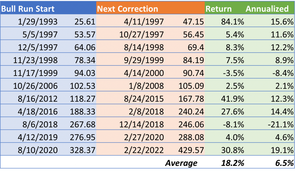
Return answers “What would the return be if you bought the new all-time high and then sold the next correction?”
Annualized answers “What are the annualized returns for this approach?”
While the returns aren’t as good as a perfectly timed bull run, they’re usually pretty good. Plus, they have the added benefit of not actually requiring any special timing. You know both milestones have happened immediately and can methodically trade them.
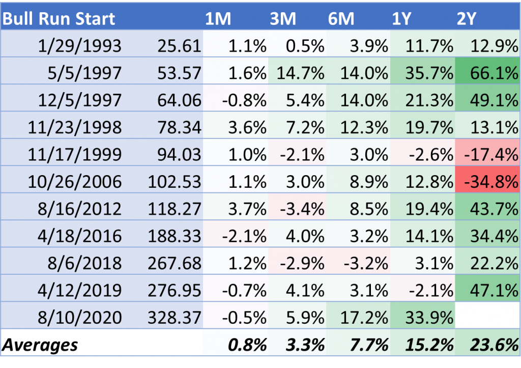
What happens if you invest at the start of a bull run?
But even if you don’t plan to sell at the start of the next correction, historical returns have been pretty positive for investing at the start of a bull run. All-time highs tend to be bullish signals for the market, so there are usually solid gains to follow.
Here are the returns for various terms once the market has reached a new all-time high after a correction.
How do we know when a correction is coming?
While there are no guaranteed ways to identify where we are in a correction cycle, there are some interesting insights that come from option-centric data. Unfortunately, SPY options only began trading in 2005, so there is relatively limited history. However, there is enough to notice a few patterns in some recent corrections.
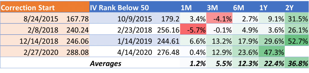
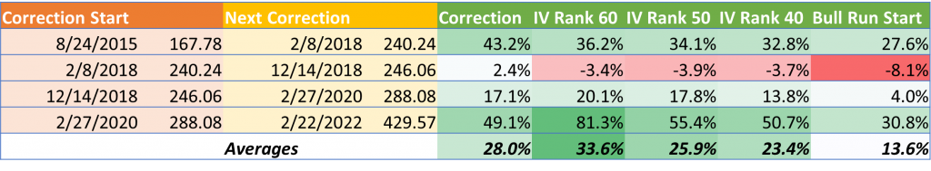
One of those insights comes from the implied volatility (IV) of SPY options. In its most simplified sense, IV is a good measure of how much premium investors are willing to pay for downside protection. As a result, IV goes up when the market gets worried, and then settles back down when things seem safe again. SPY IV is very closely related to the Volatility Index (VIX, aka the “Fear Index”) and should track pretty closely.
As expected, the charts below illustrate this phenomenon. There is a clear inverse relationship between price and implied volatility.
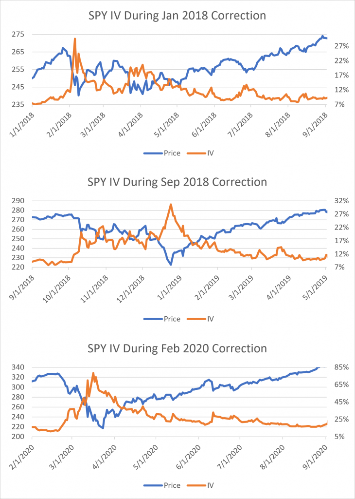
Unsurprisingly, the market has consistently bought insurance against potential drops using SPY options. And since investors often try to be ahead of the curve, the IV spikes generally precede the actual drops. Of course, sometimes a subset of investors get spooked and there’s a minor jump in IV without an accompanying drop in the underlying. But when the broad market sentiment expects a drop, everyone piles on and IV can go through the roof. The larger the IV spike, the larger the expected decline.
The data used in these charts is the 30-day implied volatility for SPY options. However, there are many other terms available ranging from 10-day to 1080-day. These terms are useful in comparison because they can help understand how far out the market is pricing risk. For example, if there’s an important Fed meeting in 25 days, the 10-day and 20-day IVs will typically be much lower than the 30-day and beyond IVs because the longer-dated options are being employed for insurance.
The volatility data used in this analysis is from our Historical and Implied Volatilities database available through Nasdaq.
How do we know when a correction is easing?
While IV can be a good immediate-term gauge for entering a correction or approaching a drop, it’s not necessarily useful for identifying when the low has been hit and the market is in recovery mode. Part of the reason for that is that it’s unclear what levels IV will stabilize around.
- In the two 2018 corrections, IV topped out around 30%. But in 2020, it was around 80%.
- When IV relaxed in 2018, it settled in the 8-12% range both times. In 2020, it stayed above 15% long after the recovery was in progress.
Fortunately, there is another measurement that has shown some promise in identifying the latter stages of a correction: IV Rank. IV Rank measures the relative valuation of IV using recent history. It takes the past year of IV measurements for a specific term, such as the 30-day IV used here, and indexes the value relative to the overall range. If the IV for the past year has ranged from 20-40%, then a current IV of 35% would have an IV Rank of 75% since it’s 75% of the way from 20% to 40%.
Historically, IV Rank has been used by option investors to determine when to buy or sell options. The argument is that when IV Rank is over some arbitrary number, like 50%, then it’s overvalued and should be sold with the expectation that IV will revert to its longer-term mean. However, in our research we’ve found that IV Rank has been a pretty good indicator of correction recovery.
Here’s how IV Rank has moved relative to underlying price during the same corrections.
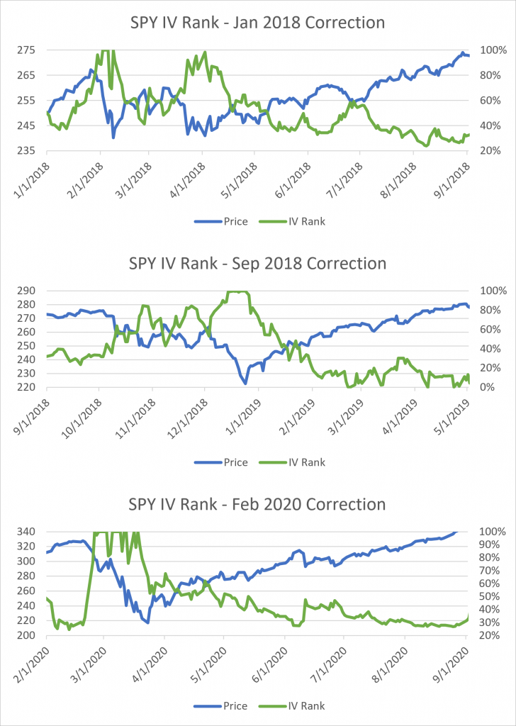
Notice how once IV Rank breaks down through 50% it tends to stay below it for the duration of the correction cycle. While the sample set is small, it seems to happen soon after the correction has bottomed out and long before it reaches new all-time highs. It may be one of the strongest indicators that the worst of a correction is over.
Here’s what the returns look like from the first day IV Rank breaks below 50% during a correction. Note that the data used only goes back to 2010, so corrections begun before then are not included.
The nature of these returns are based on the premise that the market sentiment is improving, so insurance via options is being reduced. The 50% threshold isn’t really a magic number. It’s just a nice round number that translated to the correction turning the corner to all-time highs. It also doesn’t necessarily mean that the current price is above or below the correction start price.
In addition to IV Rank, there are several other popular IV valuation metrics that may offer you insight as to the status of the market or individual stocks, such as IV Percentile and IV Rating. The IV valuation data used in this analysis is from our Quantcha Option Ratings database available through Nasdaq. You may also be interested in our Quantcha Option Analytics database for other data points, such as put/call ratios, option-implied forward prices, and option breakevens.
Is there an ideal strategy for correction investing?
In addition to the correction starts and the new all-time highs, the IV Rank thresholds are metrics that can be identified in real time. As a result, it’s feasible to develop an investment strategy that includes different thresholds for a disciplined approach.
Here’s what the returns for different identifiable milestones look like relative to the next correction start. Additional IV Rank thresholds are included to illustrate additional options.
In this chart, the returns for each milestone are measured from the date they occur to the date of the next market correction. We use these specific milestones because they are all observable the day they happen. However, this means that each return has a different term length. In the chart they are ordered from longest to shortest since the correction starts first, then the IV Rank recedes, and finally a new all-time high marks the start of the next bull run.
Correction answers “What was the return between the current correction’s start to the start of the next correction?”
IV Rank 60 answers “What was the return between the first time IV Rank broke below 60 and the start of the next correction?”
IV Rank 50 and 40 answer the same as the above, but with lower thresholds.
Bull Run Start answers “What was the return between the first post-correction all-time high and the start of the next correction?” This data was covered earlier and is included for completeness.
The good news is that there really doesn’t need to be an ideal strategy for investing during a correction. Since the market has historically always eventually returned to all-time highs, it’s always been a matter of time before the gains come. However, IV Rank does seem to be a strong indicator of when the worst of a correction has passed, which is generally the best time to get in for a bargain.
Key correction conclusions
This report highlights a lot of details around corrections and the nature of returns that can be expected at given milestones. Here are some of the key conclusions we’ve come to in the process of researching it.
Time in the market appears superior to timing the market. Even with reliable option-centric data, it’s difficult to tell when a correction is about to happen, and the risk of losing out on potential gains in order to avoid losses is harder than it looks.
Long-term returns from the start of a correction tend to be good at any point. While it doesn’t seem to be possible to detect a bottom, metrics like IV Rank offer hints as to when the worst has passed.
Using identifiable milestones for investment planning is an effective approach. Since it’s impossible to determine when the last pre-correction all-time high or correction low have been hit, basing decisions on measurable events within the correction cycle seem to be the best path to consistent positive results.
Questions or feedback?
Please reach out to us at hello@quantcha.com.